Blog

7 Simple Ways to Tell if That Menacing Email is Spam

So let’s suppose your spam filter lets an email through to your inbox that looks legit on the surface but is really phishing spam. Not all spammers are stupid enough to pose as a Nigerian prince with piles of cash. Often spammers will use menacing or alert type emails to get you to click on a link. One approach the spammers take is to make it look like there is something wrong with your account.

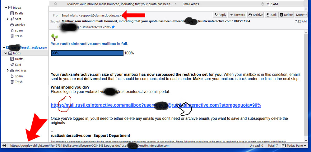
I got this email today and although I know that my mailbox quota was not exceeded, I checked just in case. At first glance, early in the morning on my first cup of coffee, this email looked kind of legit. Upon consuming more coffee and further examination, I thought this spam example might make for a good post.


email spam example


Here are some simple things to notice: 

  1. Timing: It was sent early in the morning when someone seeing such an alert might click on a link before examining the email very well.
  2. Look at the From address. (smaller red arrow) This address has nothing to do with my web host or mail server, neither of which is in New Zealand. In the preview window of this email client or on a mobile device the From address is not displayed, so it is important to avoid jumping at the chance to click on a link until you see where the email actually originated from.
  3. Sneaky branding: They include an image that I use in my branding. This is actually a very poor image to choose because it is a tiny favicon and therefore appears pixelated in this email. But automated scrapers can easily grab these little icons for any page on the web. Spammers will try to make you think their missive is legit by any means they can.
  4. Urgency in the message: Notice the scare tactic in the copy. This one states that my mail box is full, emails are bouncing, and furthermore this will be communicated to the senders. These senders might be new business or existing clients, but it is a scare tactic to try to increase urgency in my response. Also, when reading the copy in a suspect email, look for poor grammar and sentence structure. This one is written well, but they do make an error in leaving out a space after ‘not delivered’. Sometimes the English is so bad you know it originated from a non-native speaker and this could raise a red flag.
  5. Appearance of Legitimacy: Notice that at a glance the hyperlink looks legit. Often webmail will use a subdomain for mail functions. However, look closely and you will see the https is followed by a semicolon rather than a colon (circled in red). This makes the automatic linking the email software does inoperable such that the programmed link will be active. They have programmed the link to go somewhere else than that which is shown to you.
  6. Spam Links: If you mouse over the link (careful not to click on it), you will see the programmed link come up in the lower left of the mail window showing you where the spammer really wants to send you when you click the link. (big red arrow) This URL obviously has nothing to do with my domain or hosting. This URL actually goes to a page of their choosing that will seek to do something nefarious.
  7. Fake Corporate Structure: This one is easy for me. The email says it comes from my domain support department. I don’t have a support department. In a small business, you know your business structure and you know if you have a support personnel or whatever bogus department they are touting.

If these little tells do not do the trick, there are deeper ways to dive into an email to see if it is spam. But these simple pointers will help you decide if a suspect email can pass a smell test. If you are still in doubt, and a client of mine, just forward them to me and I will dive in and let you know.

But, when in doubt, do not click on anything!


Do you need a mobile app? Maybe not.

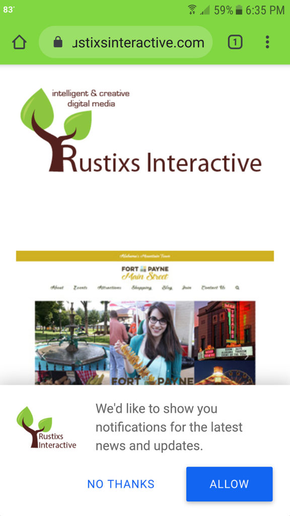
PWA Permissions pushDepending on your needs, a native app may be where it is at for you and your users. Mobile applications with push notifications achieve up to three times more retention than their counterparts without push, and a user is three times more likely to reopen a mobile application than a website. In addition, a well-designed mobile application consumes less data and is much faster because some resources reside on the device.

So, do you need a mobile app? Maybe. Maybe not. There is an alternative that hits a sweet spot and in many ways is better than a conventional mobile app. Progressive web application (PWA) technology has advantages over a native web application, chief among them being cost and time to development.

A PWA takes advantage of a mobile app’s characteristics, resulting in improved user retention and performance, without the complications involved in maintaining a mobile application. The user experience is similar to native apps on desktop and mobile devices.

PWA is a technology that creates a middle ground between a website and a mobile app. They are installed on the phone like a normal app (web app) and can be accessed from the home screen. Users can come back to your website by launching the app from their home screen and interact with your website through an app-like interface.

PWAs are traditional web applications that are enhanced with modern web technologies, allowing them to provide a more app-like experience. The “progressive” part means they’re “progressively enhanced” with modern web features, which means they’ll also work in older browsers that don’t support the new features, but will work better and with more features in modern browsers. They are always served via https, which means the data is secure in transit.

PWA are not like other apps in that you do not have to package them and submit to an app store which can save considerable time and expense. They are not platform specific — you do not have to develop different versions of the app files and submit new versions to various app stores to update it.

PWA are:

…reliable – they load very fast. Key resources are pre-cached on the device eliminating dependence on the network, ensuring an instant and reliable experience for users. All platforms and browsers that support PWAs can us the same app.

…fast – they respond quickly to user interactions with smooth animations and no jerky scrolling.

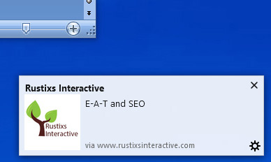
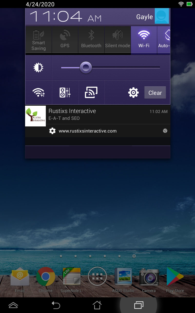
PWA Push notification…engaging – they feel like a natural app on the device, with an immersive user experience. PWA are install-able and live on the user’s home screen, without the need for an app store. Push notifications are possible using secondary services. New content is made available to the user if they have connection to the internet. A wide variety of key performance indicators are improved significantly after PWA implementation.

…economical – separate app development costs are not required. A single PWA supports everything, rather than making separate apps for iOS, Android, Windows and the web. And better yet, there is software and services to make a website perform as a PWA.

…findable – search engines will be able to crawl the web and find available PWAs online. This is a major advantage over native apps. If desired, PWAs can be listed in app stores for easier discovery and installation, but you do not have to submit there and go through the approval hoops.

PWA Permissions push…responsive – fits any viewport/platform size: desktop, mobile, tablet.

…linkable – the URL can easily be shared and does not require complex installation. Upon visiting the URL, the user is prompted to add to their homescreen.

PWAs work on most modern device browsers and recent versions of desktop browsers. Upon visiting the website, the user is prompted to add the PWA to their homescreen. Pages they visit are cached on their device so that when they return via the app the pages load fast even if the network is sketchy.

From a maintenance and update perspective, PWAs are updated when the website is updated with new content or features. Updates do not have to be made to multiple different app stores and the same app will run on all browsers and platforms. This is a major time and effort saver.

The PWA apps can also use existing web technologies to access location services, the webcam, and other features like sharing, etc, that are associated with a native app.

Microsoft Edge, Google Chrome, Mozilla Firefox, Opera, Safari, Samsung browser and other modern mobile browsers support PWAs.

E-A-T and SEO


In mid March Google released a broad core algorithm update that adversely affected website page ranking across the board. This update further emphasized Expertise, Authoritativeness, and Trust within the page rank calculations. I have seen the figure of a ~10% reduction in organic search traffic blamed on the latest update for sites in general, although financial and health-related websites were hit harder.

This change is probably a good thing overall for search as it promotes sites that have good quality content and penalizes content/link farms. But there is the concern of how is Google determining who/what sites are worthy and authoritative.

There are two measures of E-A-T that Google uses in their calculations: website/brand E-A-T and site content author E-A-T.

Author credibility is said to be based on the information present on the web in regards to the published authors’ credentials to be writing on a particular subject. For instance, a known interior designer published on HGTV.com  would have more E-A-T than an amateur decorator pinning on Pinterest. Steps can be taken to establish author reputation and credibility, but it takes time and effort and may not be applicable to all types of sites/content.

The factors that are said to be involved in evaluating website E-A-T are:

  • Reviews
  • Site mentions (links and unlinked mentions)
  • Forums

Links and unlinked mentions are measured and the authoritativeness of the mentioning/linking site matters. Press mentions/buzz can help, but the quality of the press mention matters and a link from a quality site has even more mojo. Google is confident they know who to trust so gaming the algorithm is difficult.

News and the reputation of the company are factored into the E-A-T scoring, too.

So, how to improve E-A-T?

Good Reviews matter as a part of reputation research. The research looks at third-party sites like Yelp, BBB, Amazon and Google Shopping and other sources. They look at numbers of reviews, sentiment, and ratio of good to bad reviews.

Wikipedia is a trusted site now. Get mentioned in articles there or create your own page, if applicable. You have to have perceived authority to even get a Wikipedia page.

Get mentioned by authoritative sites. These are considered votes for your business. But beware. Google can figure out if you have paid for the link, incentivized the site owner or provided content and will not rank the mention as highly.

Get mentioned on forums. Google considers mentions within forum discussions as a source for reputation information, believe it or not. That is because these days helpful info is found in the user generated content on Reddit, Discus or other sources. If your competitors are being discussed, you should be too (for the right reasons).

Claim your listings. Take a look at your Yelp, Better Business Bureau, and directory pages. Take ownership, customize them, and encourage reviews on those channels by customers and vendors, where applicable.

Trust is a big deal. If you have lots of negative reviews or complaints about getting a refund you will drop in the rankings. If you have awards or certifications, list them on the About page. Avoid the use of annoying ads that irritate users and sap trust. Use customer testimonials on your site.